How color shapes mood, energy, and well-being—room by room
Color is one of the most powerful tools in interior design—not just because it transforms how a space looks, but because of how deeply it impacts how we feel in a space.
At Anne Haas Design, we approach color through both the lens of color theory and neuroaesthetics—the study of how our brains respond to visual stimuli like shape, light, texture, and yes, color. It’s not just about what looks good. It’s about creating spaces that support your well-being, your focus, and your joy.
Let’s take a closer look at what your home might be telling you through color—and how thoughtful color choices can shift the energy in every room.
The Entryway: First Impressions and Emotional Temperature
Your entryway sets the emotional tone of the home. Bright, light-filled palettes feel open and uplifting—like a cheerful welcome. Deep, moody tones like charcoal or navy can signal a sense of calm and sophistication.
💡 Neuroaesthetic tip: Humans instinctively respond to contrast and light. A well-lit entry in a soft neutral or warm tone can lower stress levels as you transition from the outside world into your private space.
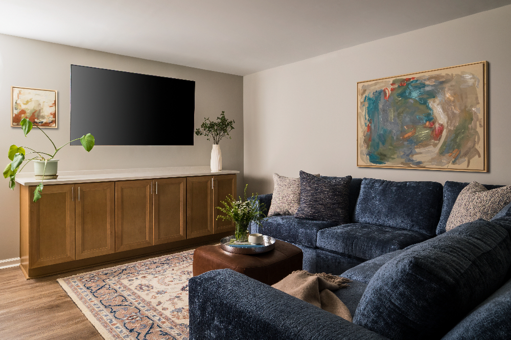
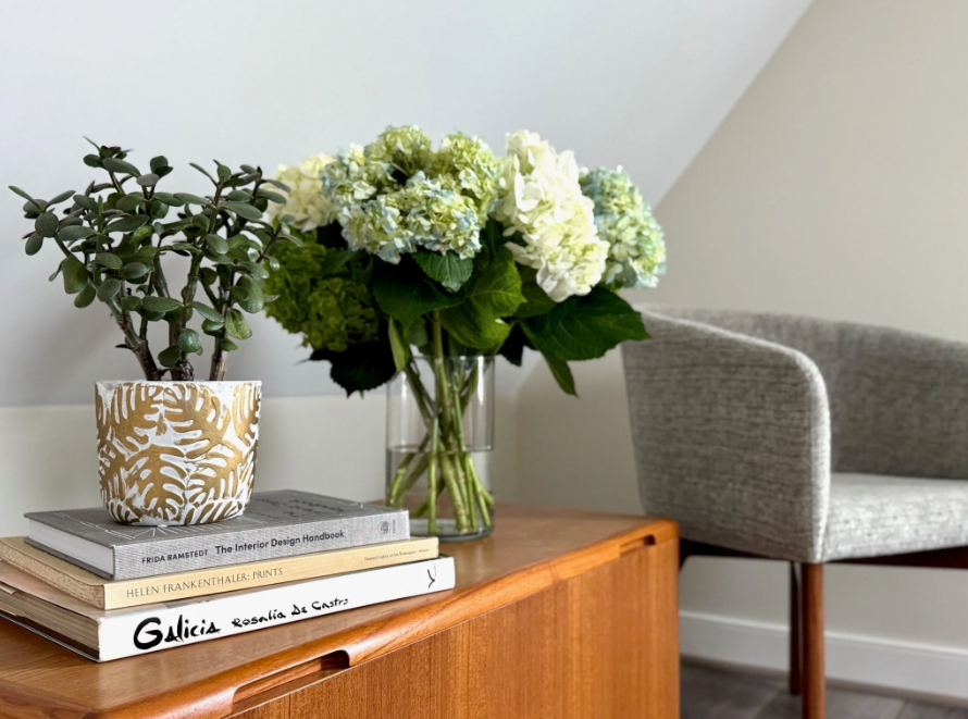
Living Room: Connection and Comfort
This is where color meets community. Earth tones like terracotta, olive, or soft browns foster warmth and togetherness. Cool hues—think dusty blue or sage—calm the nervous system, ideal for spaces meant to unwind.
💡 Psychology insight: Warm colors stimulate conversation and connection. Cooler tones reduce overstimulation, making them ideal for relaxing spaces. Strike a balance based on how you use the room.
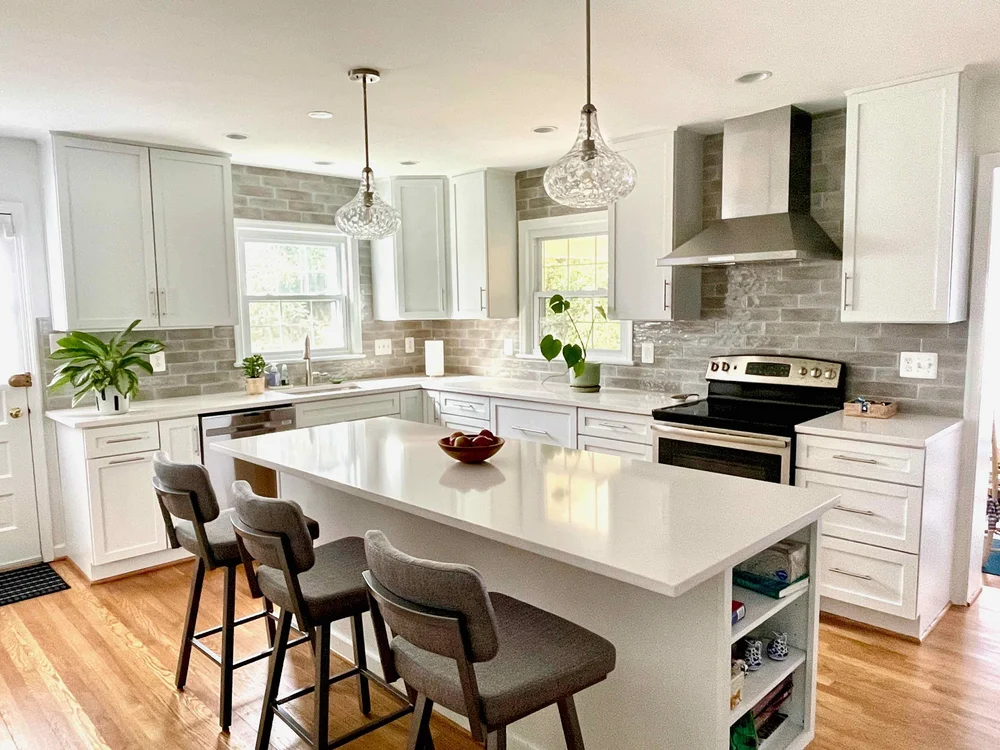
Kitchen: Energy and Focus
The kitchen is where life happens. Yellow is known to stimulate appetite and create a sense of joy, while green tones signal freshness and vitality. Blue, though popular, can sometimes suppress appetite—use it wisely.
💡 Color theory insight: Strong contrasts (black and white, for instance) activate the brain’s attention centers. If you love a high-contrast kitchen, balance it with wood, plants, or textured elements for grounding energy.
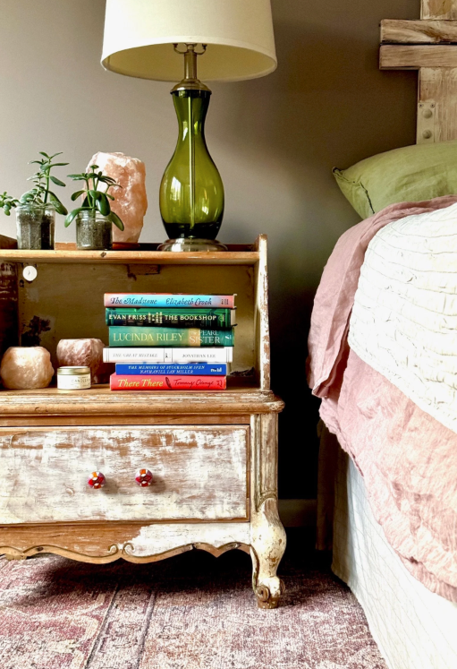
Bedroom: Rest and Regulation
Bedrooms should act as a buffer from the demands of the day. Soft blues, blushes, or lavenders calm the mind and body, while dark hues like charcoal or plum can create a cocooning effect—ideal for deep rest.
💡 Neuroaesthetic tip: Cool colors lower heart rate and blood pressure, helping the body prepare for sleep. Avoid overly saturated tones that can overstimulate the visual field.
Home Office: Clarity and Cognitive Boost
Color can sharpen your focus—or scatter it. Blue is known to enhance productivity and cognitive function. Greens support calm concentration, while accents of orange or yellow can provide a creative jolt.
💡 Design tip: Try layering a soft green wall color with natural textures and a pop of energetic color in art or accessories to balance calm with momentum.
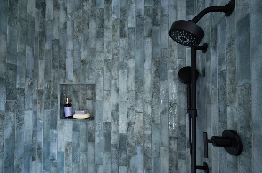
Bathrooms: Serenity and Cleanliness
Pale blues, whites, and soft greens evoke spa-like calm and cleanliness. But don’t be afraid of drama—a charcoal or deep teal powder room can feel luxurious and grounding.
💡 Why it matters: Color affects how we perceive cleanliness, warmth, and even time. Lighter tones in morning spaces help reset your circadian rhythm.
Color Is Personal—But It’s Also Powerful
Ultimately, your color palette should reflect your taste—but when chosen thoughtfully, it can also support how you want to feel in your home. The right color doesn’t just look beautiful. It creates a backdrop for well-being, restoration, and joy.
If your home doesn’t feel quite right, color might be part of the story. We’d love to help you listen.
Ready to reimagine your home through color and intention?
Let’s start with a consultation. Contact Anne Haas Design to explore how we can bring balance, energy, and beauty to your space—one room at a time.